Introduction When I was at university studying GIS these three terms used to trip me up regularly when describing data. While all are similar, they have some distinct differences that you have to know when analysing data. Interpretation The first definition is interpretation. This is the first and most simple of the concepts being shown here. It is as simple and seeing what is happening in the data as it is. What are the trends or patterns being seen within the scope of the data available.
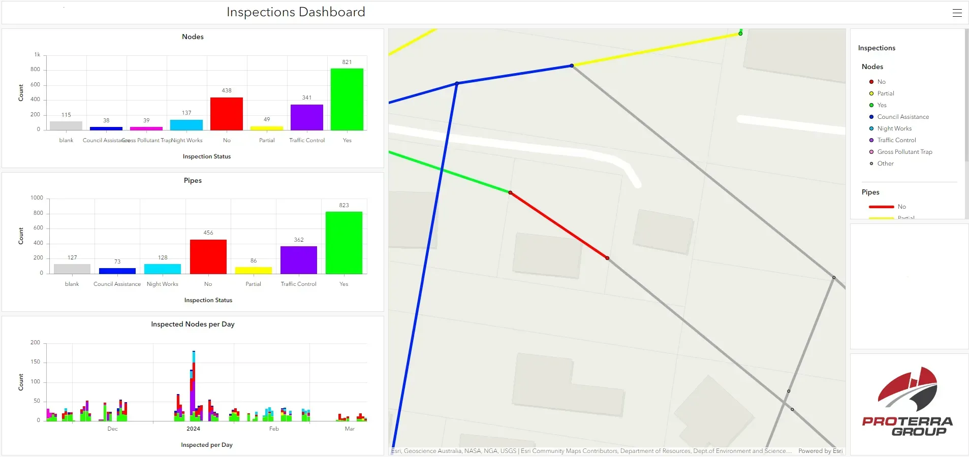
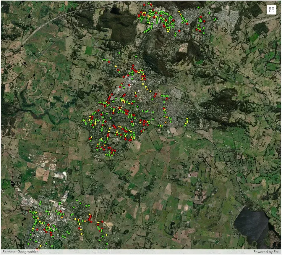
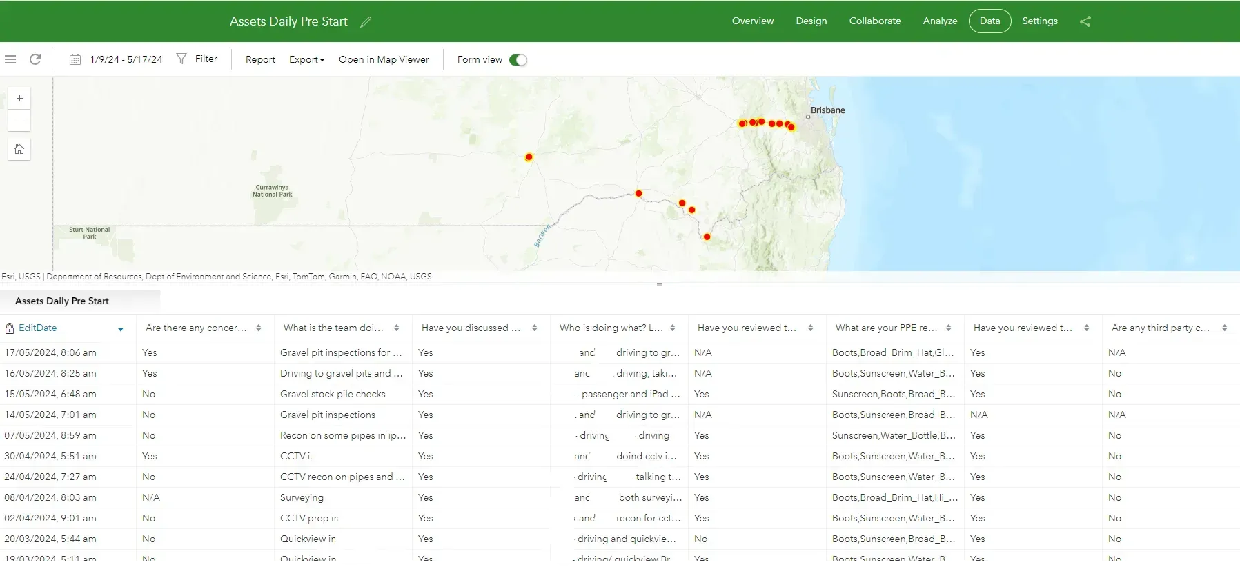
Introduction Having a large repository of spatial data is great but limited if you don’t have an effective way to display it. While tables and spreadsheets of data certainly have their place, especially around data people and engineers like ourselves, most people’s eyes begin to glaze over and any impact that your data could have is lost. That is why GIS professionals make use of apps such as dashboards and storyboards which can effectively convey not only data but knowledge or a story with it. Dashboards As mentioned above spreadsheets are great, to a degree. They contain a lot of raw data in a logical format but that’s about it. It is difficult to draw any meaningful conclusions from a spreadsheet as when it comes down to it, they’re just numbers on a page. This is where a dashboard comes into its own, the analysis of patterns and trends from your data. It does this through the use of graphs and indicators being presented in line with your spatial data. The only limit as to what kind of analysis you do with a dashboard is the extent of the data you are presenting. The applications of a dashboard are essentially limitless, if you have data, you can create a dashboard (in some sense) from it and draw more meaningful conclusions from it. Storyboards While dashboards are great for doing critical analysis of data storyboards fulfill a different niche whilst also presenting your data. Storyboards are used to tell a story with your data. Think of PowerPoint but instead of different slides you just scroll through the story. They can integrate maps, dashboards, images, videos and text all to enhance the data you are trying to convey whilst also being visually appealing to engage audiences both data driven and not. Proterra Group Examples Unfortunately, I haven’t had the opportunity to create a storyboard here at Proterra yet but there are some great examples available on Esri’s website. Dashboards, however, are Proterra Group’s specialty. See below for examples of some that we have created. Maps are a great way to visualise and disseminate your data to a wide audience of people in a short period of time.
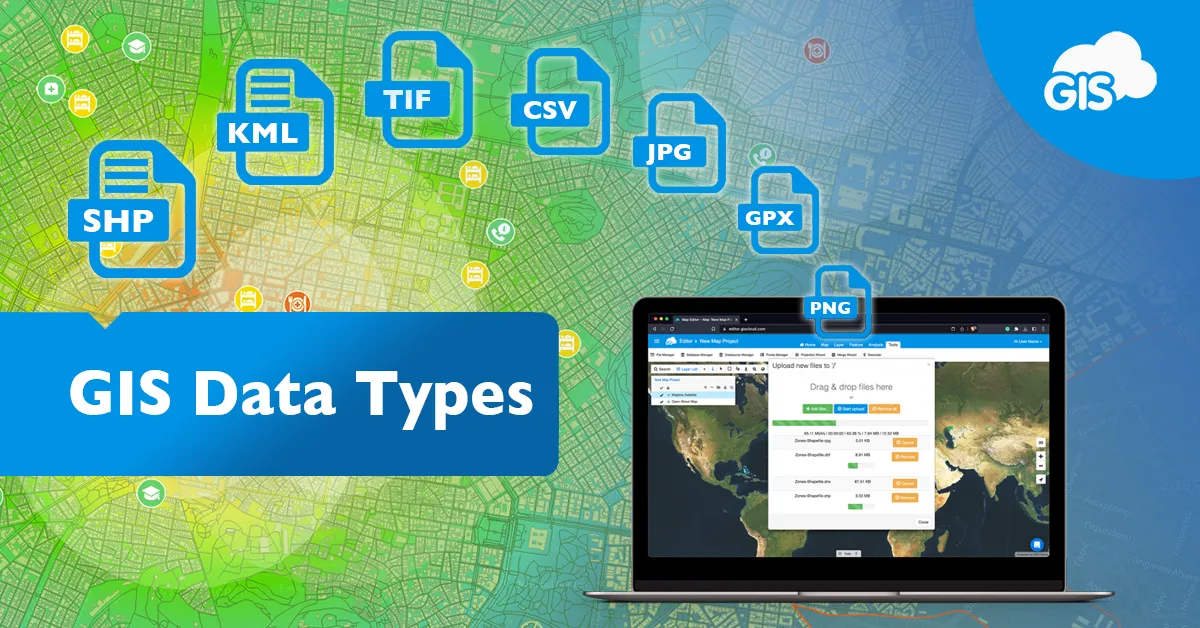
Introduction One of my biggest pet peeves as a GIS Officer is when I have received data as part of a task only to discover it’s in a completely different format to what is required or not all the relevant associated files have been attached leading to a corrupted piece of data. GIS data can be a little tricky to wrap ones head around with all the different tech jargon that gets thrown around so here is a breakdown of the main data types and file formats they are found in. What types of GIS data are there? There are two types of GIS data that you will come across: vector and raster. These two data types represent different phenomena in GIS and are very different in terms of structure and operation. Vector data refers to more traditional geometric geographic data in the forms of points (data with an x and y coordinate), lines (data with coordinates and lengths) and polygons/areas (data with coordinates and areas. Vector data can be used to visualize almost anything from pipes to buildings to wildlife habitat areas or even customer/ratepayer data. Vector data also have attributes attached to it which can be used to further visualize different phenomena within the data. The other GIS data type which you will come across is raster data. Raster data is made up of pixels with different numeric values assigned to each pixel. The most common form of raster data is satellite/aerial imagery with the numeric value of each pixel of imagery giving it an RGB colour which builds the image. Other forms of raster data include slope/elevation datasets, groundwater/catchment modelling and lidar data. In general vector data is used to represent discreet data (data with a distinct start and end) and raster data is used for continuous data (data with in between values such as surfaces). What are GIS file formats? There are literally hundreds of file formats that GIS data can take the form of, so I’ll list a couple of the major ones here; Shapefile (.shp and associated files) – The original and one of the most popular vector data file types used in Esri software. Feature Class (.gdb) – A relatively newer form of vector Esri file format, must be in a geodatabase and has a better functionality/connectivity than shapefiles. MapInfo TAB (.tab and associated files) – The native vector file format for MapInfo, must the converted before being used in Esri software. Keyhole Markup Language (.kml/.kmz) – Commonly called a Google Earth file as it is used to display GIS data in Earth browsers such as Google Earth. GeoTIFF (.tiff) – One of the most common raster data file formats although any picture file format (.jpg, .png, etc.) are also able to be read if they are georeferenced. Why is data so important? As I have previously mentioned data is one of the main pillars of what makes GIS so making sure you are using the required data for the task you intend to do is important for maintaining accuracy and legibility. For example, some tasks just physically wont work with raster data as they do with vector data and vice versa whereas some will give you wildly unexpected/erroneous results (think tools crashing and data not working).
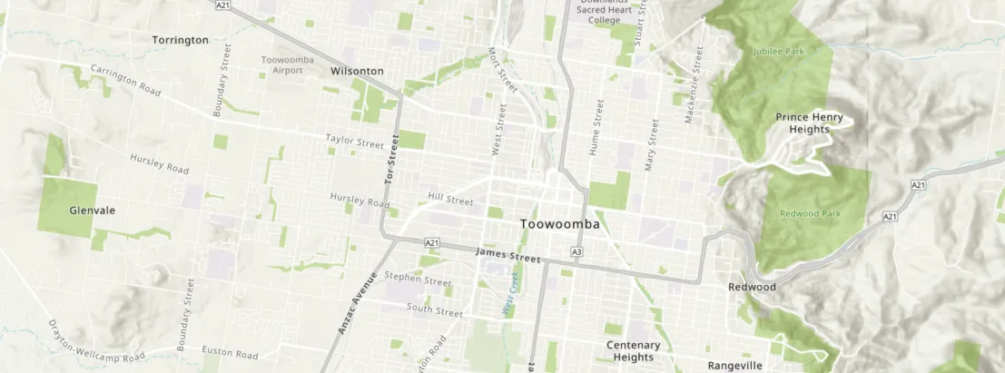
Introduction One of the main and easiest to understand parts of my role as a GIS officer here at Proterra Group is the production of maps that go into reports to easily display information. While it may seem a simple task there is actually a lot of forethought that goes into the preparation of a map and this can be the difference between a easy to understand way to convey information and something that is almost illegible. Map Design People read a map because they want to know where something is. With this in mind, there are a few features of a map that must be included. North Arrow – An arrow that points towards North based on the orientation of the map. For the majority of maps this is just the same orientation of the page however there are cases when a different orientation is useful (when mapping a road corridor for example). Scale Bar/Label – A bar or notation of the level of zoom the map is at. This also is useful for getting accurate measurement data from your map. Legend – A legend displays what layers are on the map and what they look like. Having a legend allows you to have multiple layers of the same type (lines, points or polygons) on one map while being able to differentiate between them easily. Map Credits – This is a simple acknowledgement of who created the map, who created the data and the date the data was from. This is important not only for copyright issues but also for legitimising your data. The Importance of Colour One of the main issues the beginner GIS analysts and officers run into when designing maps is picking the right colours for different features. While this may sound trivial, picking the wrong colours can leave your readers confused and lead them to misinterpreting the data you present. The first thing you must consider is that your colours do not look too similar to one another. While they may look different when you are creating the map, they may not have the same contrast when printed or rendered by different computers. Similarly certain colours are associated with different features. For example, the colour associates with water is blue so for someone having a cursory glance at your map will see blue and assume it has something to do with water whereas if you coloured a river line feature red that same person would most likely not realise what the feature is. Handy Hints and Tricks Some other things to consider include How your features are labelled. Making sure features and labels don’t overlap covering the data you want to display. What basemap you use and how it interacts with your data. Title blocks, tables, images that can be added. The drawing of features such as arrows and shapes onto your map. Using patterns, hatching and gradients to differentiate data along with colour to be inclusive for people with sensory issues such as color blindness. And remember, maps are a great way to visualise and disseminate your data to a wide audience of people in a short period of time.
Introduction So far, I have mainly introduced the capabilities of GIS within a desktop context but one of the major advantages of GIS is its ability to link with an online environment. This allows for easier sharing of data between users even without a GIS system of their own and open up a world of applications such as interactive web maps, web apps, dashboards and storyboards. What is ArcGIS Online? ArcGIS Online is a cloud-based form of GIS data storage that allows you to share and store your data online. This means that any data which you or your company have and want to share with clients, or the public, can be published to the online environment with relative ease. What can ArcGIS Online do? While the ability to store and share your data on the internet is a mainstay of ArcGIS the main advantage of it is the applications. These applications include the ability to make web maps, web apps, dashboards, storyboards, field applications and experience builders. As mentioned previously, maps are a good way to convey data to people so using the internet to make a map shareable and interactive with your own data opens up a world of possibilities of what you can do with your data. It allows you to do measurements, layer data, change basemaps, search data and visualise real time captured data. What are the benefits of Web GIS? The main benefit of an organisation embracing web GIS is the increased ability to share data amongst and across organisations. The online ArcGIS environment lends itself to becoming a vast repository of spatial data which benefits both GIS and non-GIS users alike increasing spatial literacy and leading to better informed solutions and outcomes.
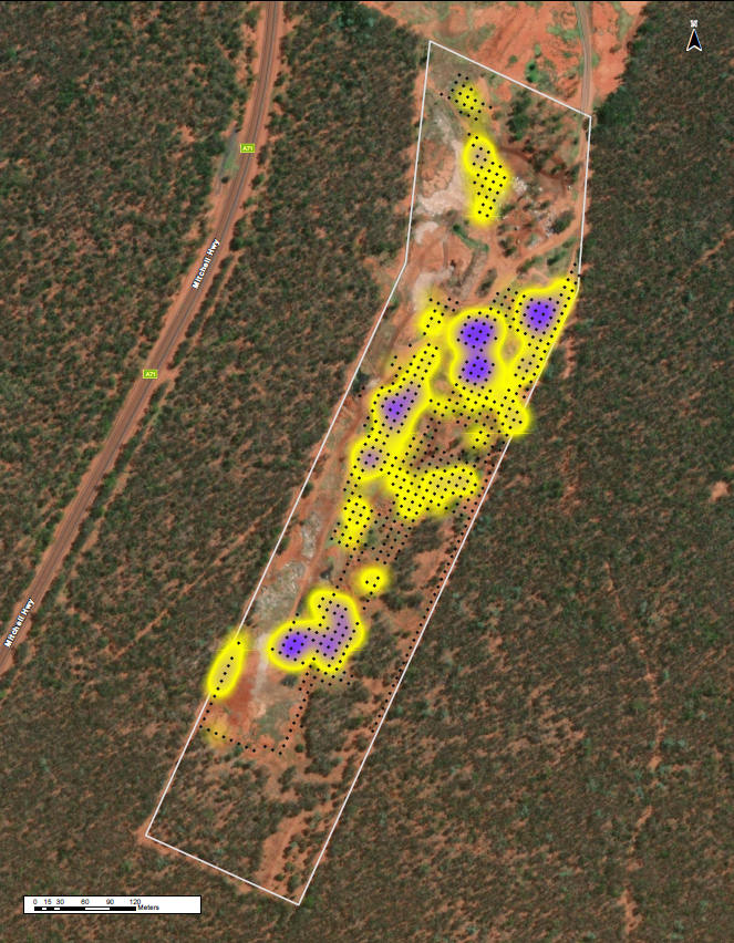
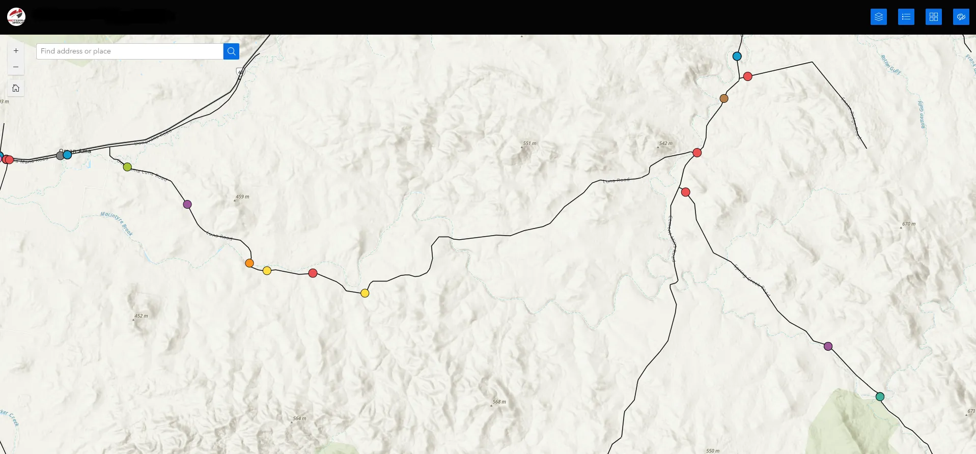
Introduction In my last few blog posts, I’ve emphasised the importance of data when it comes to a successful geographic information system, but where does that data come from and how do we collect it. If the data we use is lackluster the outputs created will be inherently inaccurate or lacking. There are multiple methods of spatial data collection each with their own pros and cons and are used in different applications. GIS Data Digitisation One of the main methods of collecting and creating spatial data within a geographic information system is digitisation. This is essentially a fancy term for freehand drawing the data in from imagery or plans within your desktop GIS application. This method of data collection is useful if you need a quickly created low accuracy dataset without any field validation. Much of what you see in maps or plans for future developments will have been digitised in GIS. While it is handy for the creation of these sorts of datasets it can be time consuming and tedious if needed for a large dataset or can look jagged if not done correctly. A good example where we have used this method is our Kerb and Channel Mapping project we completed for Logan City Council. GIS Data Digitisation One of the main methods of collecting and creating spatial data within a geographic information system is digitisation. This is essentially a fancy term for freehand drawing the data in from imagery or plans within your desktop GIS application. This method of data collection is useful if you need a quickly created low accuracy dataset without any field validation. Much of what you see in maps or plans for future developments will have been digitised in GIS. While it is handy for the creation of these sorts of datasets it can be time consuming and tedious if needed for a large dataset or can look jagged if not done correctly. A good example where we have used this method is our Kerb and Channel Mapping project we completed for Logan City Council. GPS Surveys A GPS survey is probably the most accurate form of data collection in terms of spatial accuracy. This involves using GPS survey equipment and satellites to collect data points to millimeter accuracy. The data is then converted and transferred into GIS for display and analysis. Due to the accuracy you get from a GPS survey they can be very expensive compared to the rest of the methods mentioned. Proterra Group used this method when surveying and condition rating the stormwater network within the town of Toogoolawah in Somerset Regional Council. Field data collection apps Another method that Proterra Group use is certain field data collection applications made by Esri such as Field Maps and Survey 123. These apps allow for the editing and creation of spatial and attribute data which then feed directly into ArcGIS Online. This allows for live data collection and display. In terms of accuracy its sits somewhere in the middle of a GPS survey and digitisation as it uses the inherent accuracy of the device you are running it through. Data is integral to a functional and accurate Geographic Information System so how it is collected can be a make or break so to speak. Field data collection apps Another method that Proterra Group use is certain field data collection applications made by Esri such as Field Maps and Survey 123. These apps allow for the editing and creation of spatial and attribute data which then feed directly into ArcGIS Online. This allows for live data collection and display. In terms of accuracy its sits somewhere in the middle of a GPS survey and digitisation as it uses the inherent accuracy of the device you are running it through. Data is integral to a functional and accurate Geographic Information System so how it is collected can be a make or break so to speak. Maps are a great way to visualise and disseminate your data to a wide audience of people in a short period of time.
What was needed? As you may have seen from the recent “Ring the Bell” posts on our socials, we have secured the preliminary 2022/23 Flood Restoration works for Moree Plains Shire Council. The initial works involve the integration of the council's financial and asset systems to compile Transport for NSW DRFA submissions for the Emergent and Immediate Restoration works, along with the Department of Public Works reimbursement for the Moree Town streets post-flood clean-up expenditure. What did we do about it? Initial proactive response and rapid delivery, set up by Cameron & Sandra Mocke and Nicole Wuehrl (thanks team) showed our client our capability to complete the works in the required timeframes. Thanks to this initial set up, Nicole has been continuing with these document build-ups. She has also started with the REPA submissions for the Restoration work, which once approved will see the reconstruction completed over the next 2 year period! Nicole has risen to the challenge, basing herself in Moree to maximise her time and shorten the completion timeframe and has built a great rapport with the council's’ Flood management team in the Moree depot, fantastic work Nicole! In addition to the analysis phase of the work, Inspector Grant Sommer has moved over from Quilpie to Moree to help supervise Council direct Labour and Contractor crews, both mentoring and auditing their systems and work processes for conformity to specifications and development in readiness for the upcoming restoration program and he is doing well on this front. What now? The great news here is thanks to the work of the team, we have been able to establish work on securing a more permanent presence in the shire, between Nicole and Grant’s close work with the client it's looking more likely that we will continue to build a larger team in the Moree Region and assist Council to deliver other emerging works Levee Bank and other infrastructure works. We love seeing our teams thrive in supporting regional communities and building relationships with councils that are long-lasting.
An explanation of the basic concepts, components and applications of Geographic Information Systems by our GIS Officer, David Mitchell.